 SaaS Forge
File Uploader Module
Includes a form to select and upload a file, as well as backe-end part to send the file to AWS S3 service. You can specify if you want to select and upload only one file and the multiple uploads with multiple files shown as a gallery.
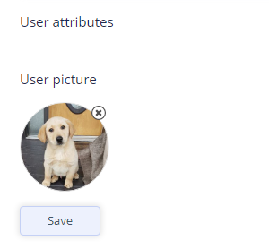
Single file upload:
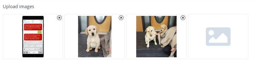
Multiple file upload:
Features
You can specify:
- src - URL to the file to show
- previewWidth - width of preview image
- previewHeight - height of preview image
- previewIsRound - false or true (false by default)
- generateIdName - false or true (false by default), indicates if the module should generate ID name for the newly uploaded image
- folderName - subBucket (or subfolder) on AWS to upload files to
- deleteFileHandler - a function to handle the deleting file from the server. This component provides deleting itself, and notify the handler about this fact for it to update the database. It passes result and url of the image
- showModalOnClick - if true, shows the modal on image click with bigger image. By default is true
- filesChangeHandler - pointer to the function that will be called if user selected a new picture(s)
- uploadOnSelection - if true, the files should be uploaded immediatelly after selection. False by default
- defaultIcon - fontawesom icon name (without "fa"). If not specified, the component's default icon is used.
- showAlert - if true show the component's alert. False by default.
How to use
Set up your account on AWS
Step 1. Create an account and get your credentials (click on your account name -> select My security credentials -> click Access keys). Copy these 2 keys into the following env variables:
AWS_ACCESS_KEY_ID AWS_SECRET_KEY
Step 2. Create a bucket. Add its name as another env variable: AWS_BUCKET_NAME
Step 3. Change your bucket permissions.
- In the Block public access unblock all properties
- In the Access Control list, add Public access to read and write objects
- In the Bucket policy, add something like that:
{
    "Version": "2012-10-17",
    "Id": "Policy15605345364204",
    "Statement": [
        {
            "Sid": "Stmt156012333612",
            "Effect": "Allow",
            "Principal": "*",
            "Action": "s3:GetObject",
            "Resource": "arn:aws:s3:::<your_bucket_name>/*"
        }
    ]
}
It's just an example because this policy grants a right to get object. It's useful when you need to provide a public access to your files.
Add component
import FileUploader from '@src/modules/fileUploader/FileUploader.jsx';
Add the component:
<FileUploader
        showFileName={true}
        previewWidth="200px"
        previewHeight="120px"
        previewIsRound={false}
        generateIdName={true} />
Before using, in the parent component's constructor, add the following line:
this.fileUploader = React.createRef(); // Name of the object can be any.
Then in the
ref={this.fileUploader}
Then you will be able to call the upload process just calling:
const uploadData = await this.fileUploader.current.upload();
console.log(uploadData.result);
console.log(uploadData.urls);
The returning result is a JavaScript object in the format:
{
    result: true/false,
    urls: array of URLs newly uploaded files
}
Props:
- src - URL to the file to show
- previewWidth - width of preview image
- previewHeight - height of preview image
- previewIsRound - false or true (false by default)
- generateIdName - false or true (false by default), indicates if the module should generate ID name for the newly uploaded image
- folderName - subBucket (or subfolder) on AWS to upload files to
- deleteFileHandler - a function to handle the deleting file from the server. This component provides deleting itself, and notify the handler about this fact for it to update the database. It passes result and url of the image
- showModalOnClick - if true, shows the modal on image click with bigger image. By default is true
- filesChangeHandler - pointer to the function that will be called if user selected a new picture(s)
- uploadOnSelection - if true, the files should be uploaded immediatelly after selection. False by default
- defaultIcon - fontawesom icon name (without "fa"). If not specified, the component's default icon is used.
- showAlert - if true show the component's alert. False by default.
Functions:
- filesBeenChanged call this function to check if new files have been selected, returns true or false.
- upload - call this function to initiate upload process. It returns an object {result: Bool, urls: Array}