 SaaS Forge
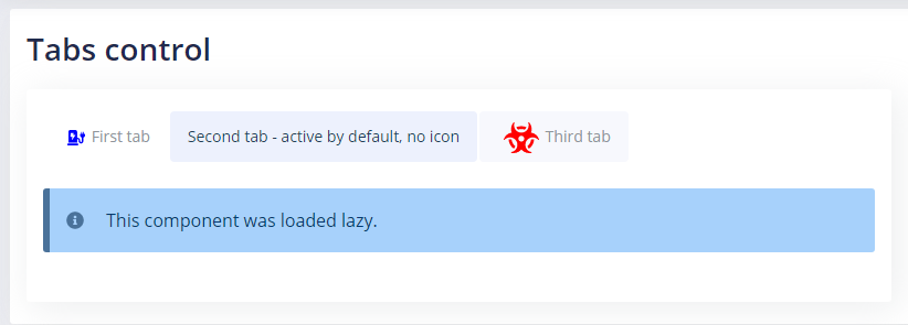
Tabs Control
This ReactJS-based, customizable, data-driven component allows creating nice looking tabs control very fast and easy.
Features
- Based on a simple JSON structure
- you can load content from JSX code or make a lazy import from a component.
How to use
import TabsControl from '@src/components/tabsControl/TabsControl';
this.state = { tabsData: [{ title: 'First tab', id: 'firstTab', content: (<div> <Alert status="error" message="This tab was loaded from tab data item's content." /> </div>), icon: 'charging-station', iconColor: 'blue' }, { title: 'Second tab - active by default, no icon', id: 'secondTab', active: true, component: lazy(() => import('@src/modules/componentsDemo/DemoLazyComponent')), data: { text: 'This data was passed from the TabsControl data object' } }, { title: 'Third tab', id: 'thirdTab', icon: 'biohazard', iconClassName: 'icon-big-red' }] };
<TabsControl data={this.state.tabsData} />
Component props
- data(JSON array of objects) - tabs items (see explanation below)
data JSON structure
Every object in this array has the following fields:
Common
- title (String) - a tab title
- id (String) - a tab id, may be any string but should be unique for all tabs as it's used as keys
Look
- active (Boolean) - if true, the tab will be active by default
-
icon (String) - Fontawesome-based name of icon, for example, "charging-station" If the previous "icon" props is null, the following props will be ignored:
-
iconColor (String) - Any string color like "yellow" or "#FFF"
- iconClassName (String) - Any custom class that will be applied to the icon
Behavior
- content (String) - JSX variable or code describing the layout of the tab content
- component (lazy loaded component) - a tab lazy-loaded import variable defined in the following format:
lazy(() => import(string_path_to_component))
Data
You also can pass a parameter into a component that is loaded lazy.
- data (Any type) - a variable of any data to be passed into a component.
You can access it as props:
<div><strong>{this.props.data.text}</strong></div>