 SaaS Forge
Left menu
ReactJS tree menu component.
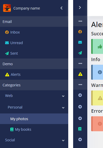
Features
- Based on a tree JSON structure
- you can add icon, set up a color, routes, and loaded components.
How to use
import LeftMenu from '@src/components/leftMenu/LeftMenu';
<LeftMenu menuItems={leftMenuItems}
        collapsed={this.state.leftMenuCollapsed}
        linkClickHandler={()=>this.closeLeftMenuMobile()}/>
Component props
- menuItems(JSON array) - menu items (see explanation below)
- collapsed (Boolean) - this props is responsible for the showing the menu in expanded or collapsed view
- linkClickHandler (pointer to the function) - this function is uded on mobile devices to close the menu on a menu item click.
menuItems JSON structure
JSON array of objects. There are objects of 2 types:
- groups (non-expandable titles, grouping several items of the first level under)
- items - menu items.
A group has 2 fields:
- groupTitle (String) - group title
- items (Array of objects) - array of items.
An item has the following fields:
- title (String): menu item title
- icon (String or Array of strings): Fontawesome classes, for example:
icon: ['fab', 'facebook']
// or
icon: 'envelope',
- color (String): string color like 'red' or '#445566' for the icon
- url (String): menu item url
- component (lazy loaded component): the component (view) that will be loaded into a container (accroding to its route), has the following format:
lazy(() => import('@src/<path_to_component>')) - items (Array of objects): array of nested items
Example of the top menu JSON:
const dashboardMenu = [
    {
        groupTitle: 'Email',
        items: [
            {
                title: 'Inbox',
                icon: ['fab', 'facebook'],
                color: '#e4951f',
                url: '/app/inbox',
                component: lazy(() => import('@src/modules/inbox/InboxUI'))
            }
        ]
    }];
Note 1. If no icon provided only title will be shown.
Note 2. If an icon is provided but no color, the default color will used. It can be found in /src/shared/theme/dashboard.scss:
aside.collapsed .aside-menu .menu-item svg {
    color: #1fe4b7;
}